Canva is an ace tool to help us design pretty things, fast.
We have a central account for SayYesMore which we’ll invite you to if you’re a Tribe or Event Leader who needs to design covers for Facebook, Eventbrite and the like.
And on the SYM Team Facebook group here’s a video guide to get you started.
Key Rules
1) All Covers to be designed within your regional Canva. Please don’t create a whole new Canva for new designs, just make a new graphic within your region’s template.
Each of these Canvas contains templates for all potential events. When designing, click on your regional Canva and design within there.
2) Once within your regional template either enter new details into an existing template, or for brand new events copy a design and edit the new one.
The copy/page icon looks like one sheet of paper hovering over another. Click this and it’ll make a copy of the design.
3) IMPORTANT! Once Events are posted on Facebook your same design will show in two different places. As the cover image of your Facebook event, and in a thumbnail on Event summary pages.
Left: Event Summary thumbnail
Right: Event page cover image
Both: SAME IMAGE!
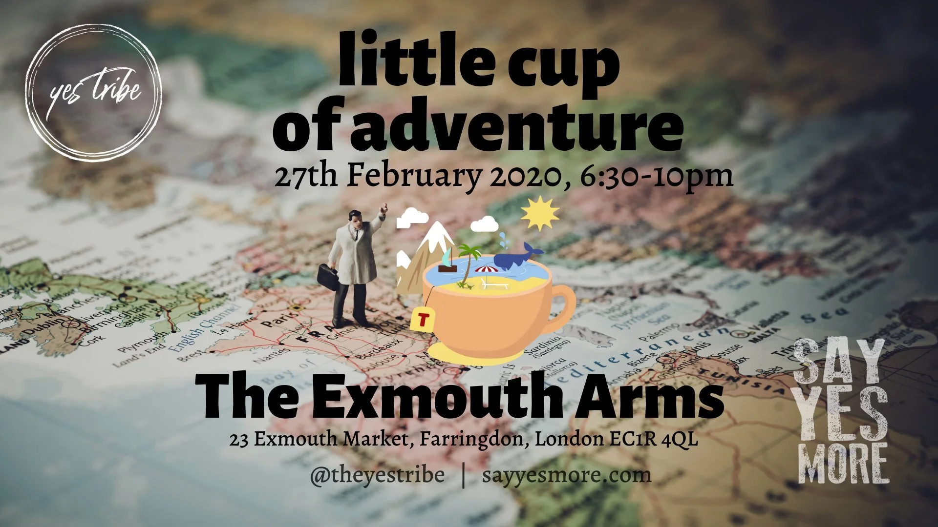
4) To keep our designing pretty, ensure that no text or logos are overlapping the central square of the cover image design. So in the example above, you can see that ‘The Exmouth Arms’ is a little too wide. Ensure your text is centralised, and still has a buffer of space between text and borders. Here, let’s redesign this.
Step 1: Get the text in the right place. You’ll see from all designs that the event type is at the top (YesStories, Little Cup of Adventure etc), then date is underneath that, then the big text at the bottom is the city/town/village, NOT the building. The address & postcode of the venue is written in smaller text above the city.
All you need to do is fill in your event details and change the background image (if you like). Everything else is ready to go.
Step 2: Now we need to ensure that all the text sits within the event thumbnail space. Imagine there’s a square in the centre of the image (this red square is your imagination), ensuring that key details are inside it.
Step 3: Centralise all text, leaving a buffer between edges of text and the (imaginary) square.
Step 4: Black text is a no no. Please ensure all text is white (perhaps with a dash of colour for a Yes). To ensure white text stands out, reduce opacity of the background (click the background image, click on the chessboard-looking icon to the top right of your canva, and then play around until your text stands out).
Ensure there’s a black filter (this is the default on all templates so you shouldn’t need to change anything) on the background, too.
So, with all of the above in mind, we’ve redesigned this event from:
to…
and now it should, in theory, look great both on the event cover AND as a thumbnail.
Yep! Looks ace!
All we need now is to change Yes Tribe to YesTribe and we’re away. But that’s what the Branding Guide is for…
I have a dream…
That every time I visit a YesTribe events page each thumbnail is perfectly designed and centred :)
(Don’t mean to pick on YesTribe London, many of these were created before the Team Summit where Thumbnail design was made a priority)


